Call on a Local
UX Case Study - 2022
Call on a Local is a responsive web application aimed at connecting travelers with the Locals via chat and call to help them discover new cities in a unique and authentic way.
The idea was born from the project “Expert” required by Career Foundry for the UX Design Certificate and adapted to fill a gap in the current market.
Project duration: 7 months
My role: UX designer & Researcher
Tools: Adobe-XD, Figma, Miro, Google Forms, OptimalSort, UsabilityHub, Pen & Paper (and many more!)
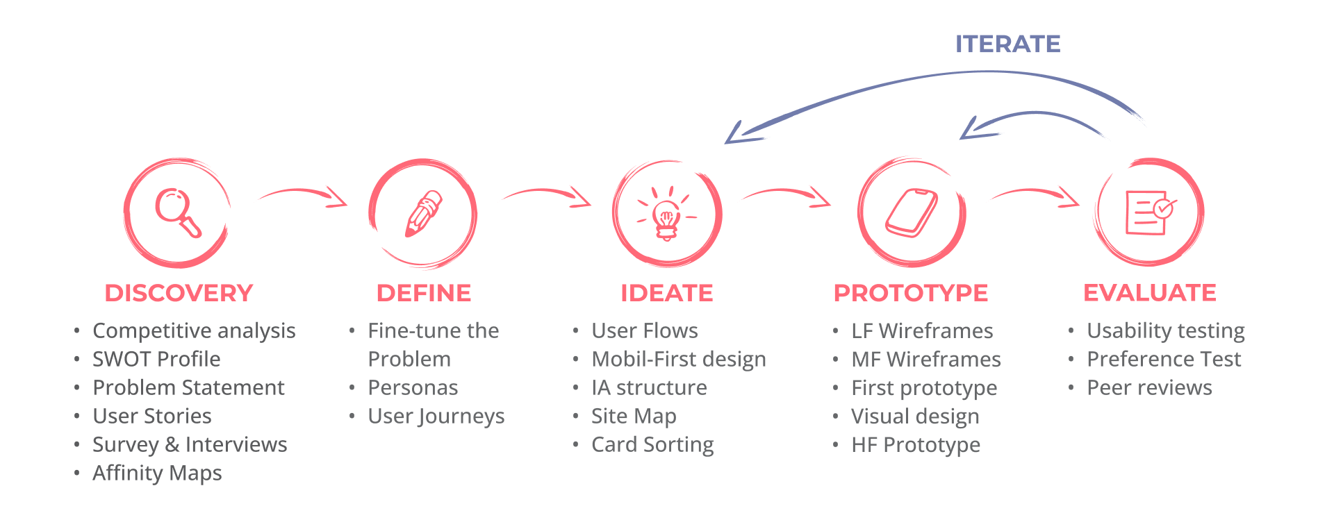
DESIGN STRATEGY
Call on a Local was designed following a user-centered and iterative approach.

DISCOVERY PHASE
Get insights to better define the problem
INITIAL EXPLORATION
UNDERSTANDING
THE PROBLEM
To solve a problem, first we need to understand it. For this, I created Problem Statements and performed Competitive Analyses. To ensure that the interests of all involved parties are aligned, I created a Business Requirements Document and brought the requirements to life with User Stories. The full documentation can be found here.
THE CHALLENGE
Many travelers look to immerse in the local culture and have a real experience of the places they visit. However, authentic local information is scarce, especially about non-touristic places.
Call on a Local users need a way to quickly contact The Locals to get genuine recommendations on their destination.
THE SOLUTION
• An app that directly connects travelers and their questions to local people via chat or calls.
• Travelers can choose their preferred expert based on the local’s profiles, which could include age, experience, main areas of expertise, spoken languages, overall rating and reviews (given only by the previous travelers), price of the service.
• Anyone who loves and knows his city can be a local expert. How good this expert is will be regulated by the travelers' reviews.
• It is important for the app to also work on phones and with a low data requirement. This would benefit the travelers who might also have a question on-site and also would allow locals from places with slow internet connections and less modern technology to also be a part of the app.
COMPETITIVE ANALYSIS
We can better understand our problem space by investigating the proposed solutions to similar problems and assessing their strengths and weaknesses. I conducted a thorough competitor analysis on two products: Go Ask a Local and Ask a Local.


USER RESEARCH AND ANALYSIS
SURVEY &
INTERVIEW
Understanding the users is key in every project. One of the best ways to achieve this is through personal interviews and surveys. With this in mind, I conducted 3 interviews and supplemented them with an online survey.
GOALS
• Confirming the target audience for the app and narrowing it if necessary (Survey goal).
• Learning about the interests and habits of the users when organizing trips and traveling.
• To learn about the goals and needs of users when traveling.
• Learning about the needs of the users that are not already satisfied and pain points when using the available services.
AFFINITY MAPS
After the interviews, I used affinity mapping to analyze interview findings. Below is the final stage of affinity mapping, where all insights were arranged into clusters.

KEY FINDINGS & TAKEAWAY
• To organize their trips, users prefer travel blogs or tips from friends to apps.
• Users like to travel mainly to know new and different places than they are used to, meet new people and cultures.
• The age of the target audience can be extended up to 50 years old.
• Not necessarily adventurous travelers would like to use the service, but also holidaymakers, culture seekers, and food lovers.
• More than a full Local experience, users are more interested in asking about little details about their destinations, such as a nice place to go that is not full of tourists, a nice place to eat, about safety, etc.
• The main questions that would like to answer are about local transport and food.
• Most users would prefer to contact the locals via chat than direct calls. Video calls are not popular.
• Preferred price: up to 30 EUR/hour
CHALLENGES & SOLUTIONS
Through the interviews, I discovered that users can be distrustful. While they are keen on experiencing new places like a local, this mistrust makes them reluctant to seek the advice of an (unknown) Local.
Based on the information gathered in the interviews and the survey, this could be alleviated by two key factors: good reviews and costs of the service. Thus, I decided to include these features:
• Reviews produced only by previous users
• Prices not exceeding 30 EUR/hour, preferably around 10 EUR/hour
• The possibility to contact the Local before engaging in a paid service
• Good and engaging Locals' profiles that will help the users to feel more connected and confident
• Videos made by locals, as another way to connect with the users.
DEFINE PHASE
Have a clear view of the problem, the goal and the users
UNDERSTAND THE USERS
PERSONAS &
USER JOURNEY
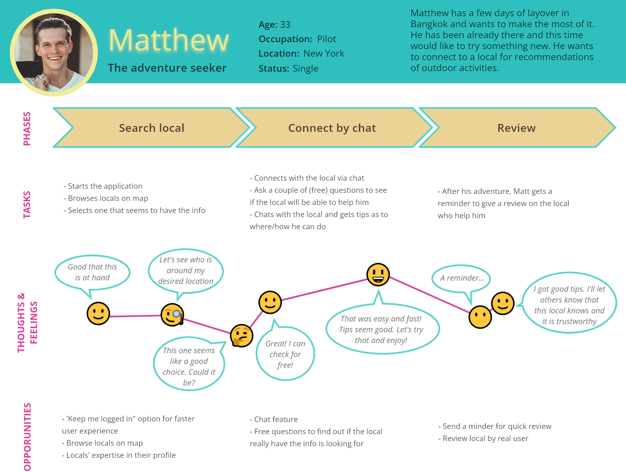
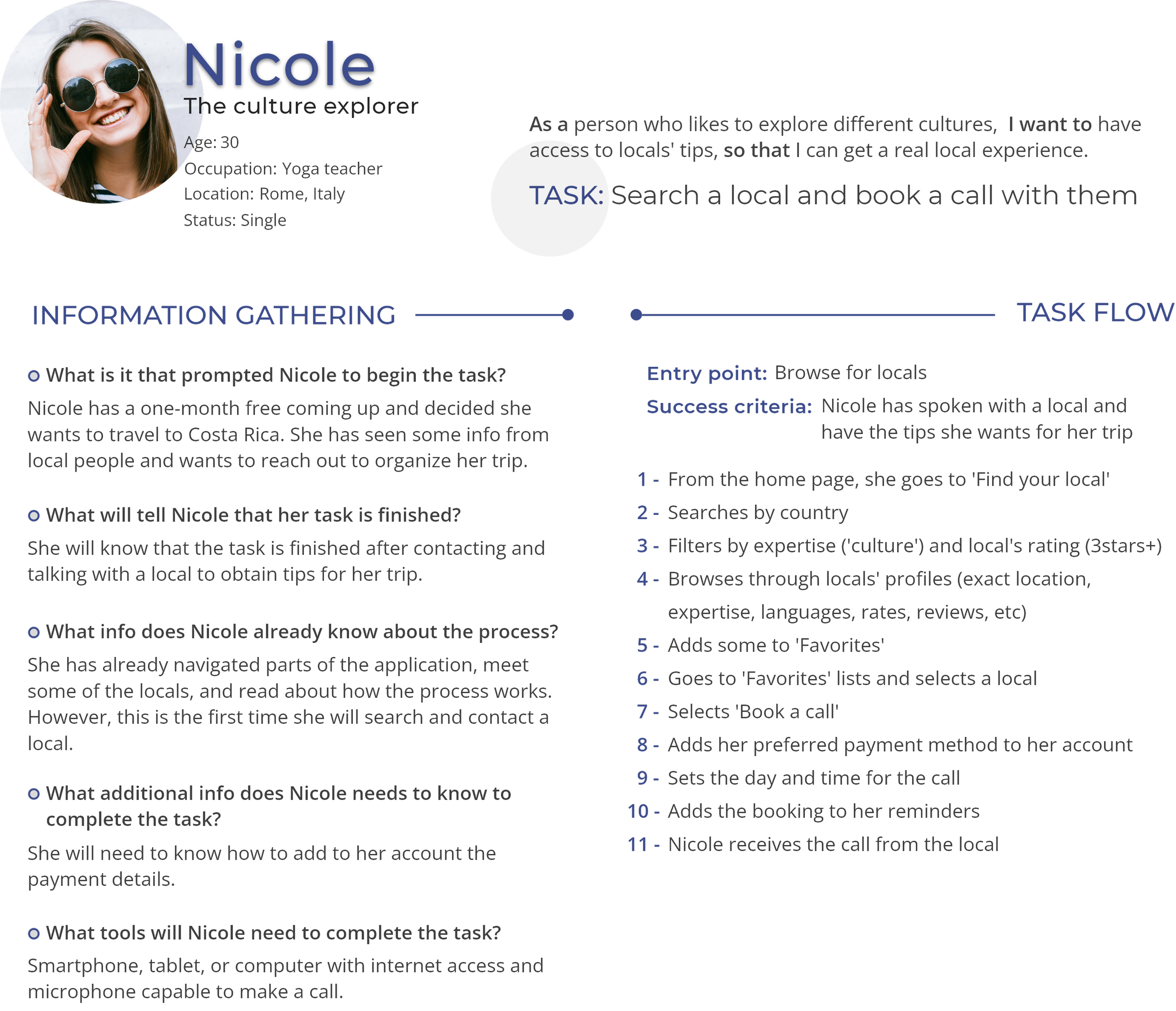
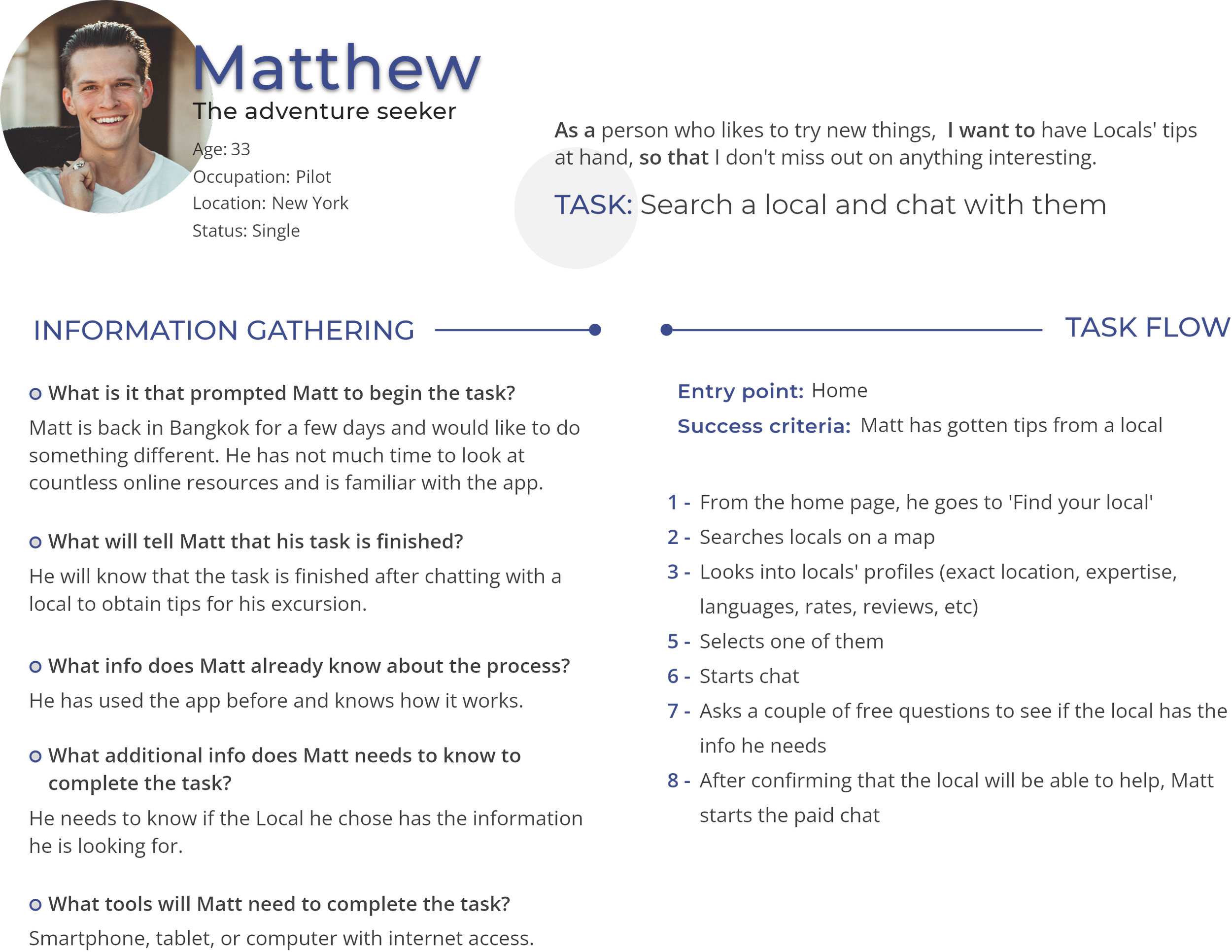
With the information gathered from the interviews and the survey, I created two different Personas and their User Journeys. These two methods help me to empathize with the user, visualizing the users' motivations, attitudes, and possible challenges.
PERSONAS


USER JOURNEYS

IDEATE PHASE
Find creative solutions to the problem
CREATE
TASK &
USER FLOWS
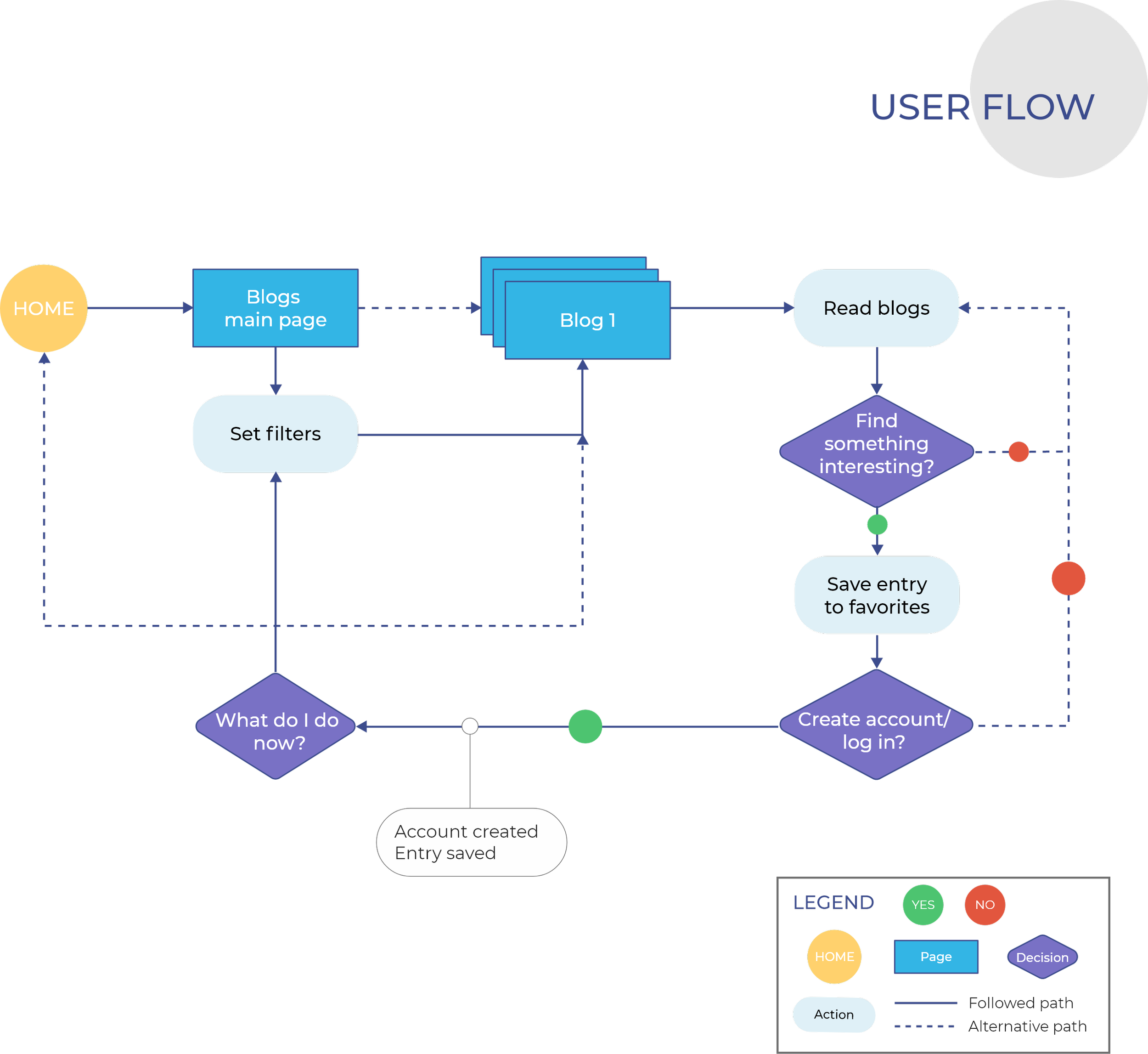
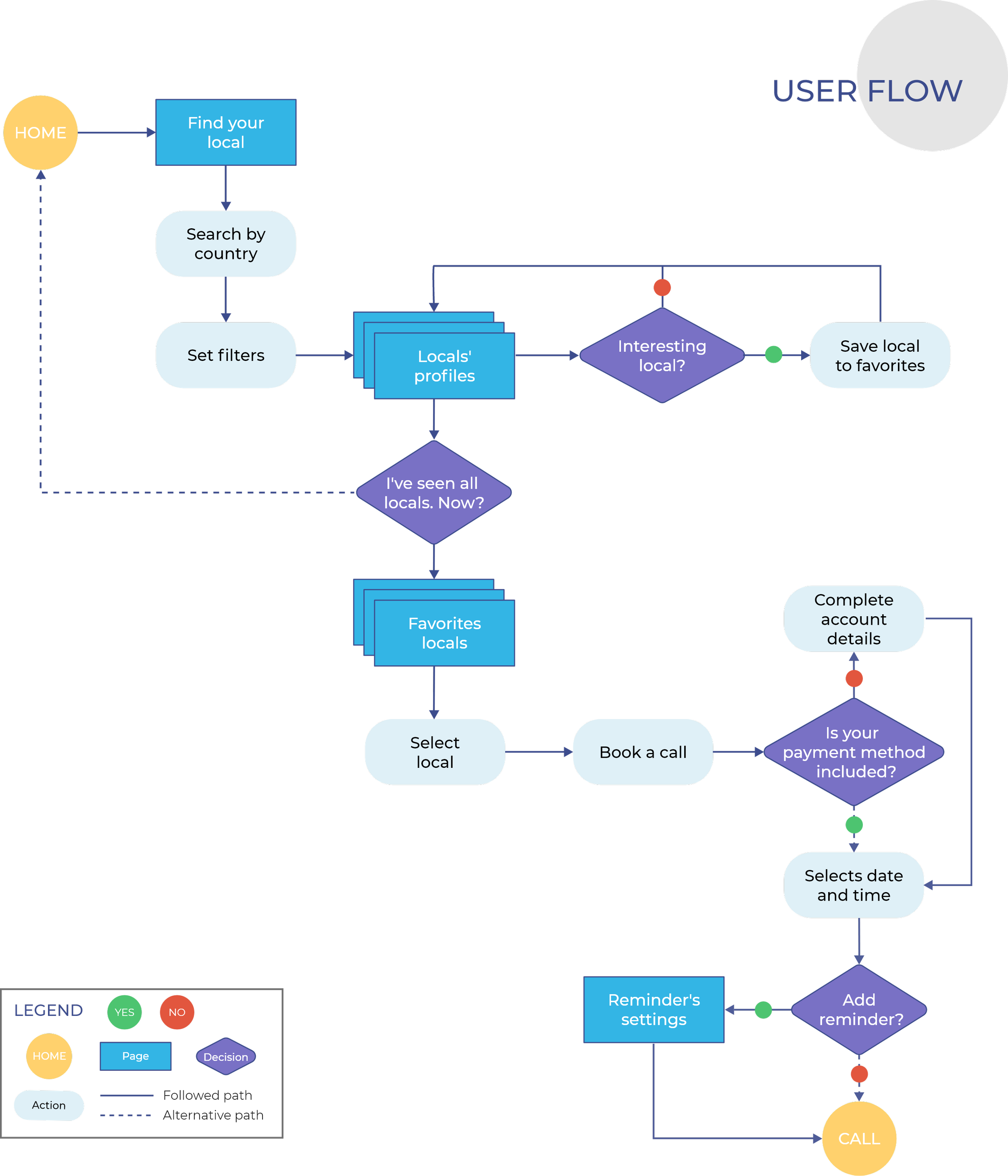
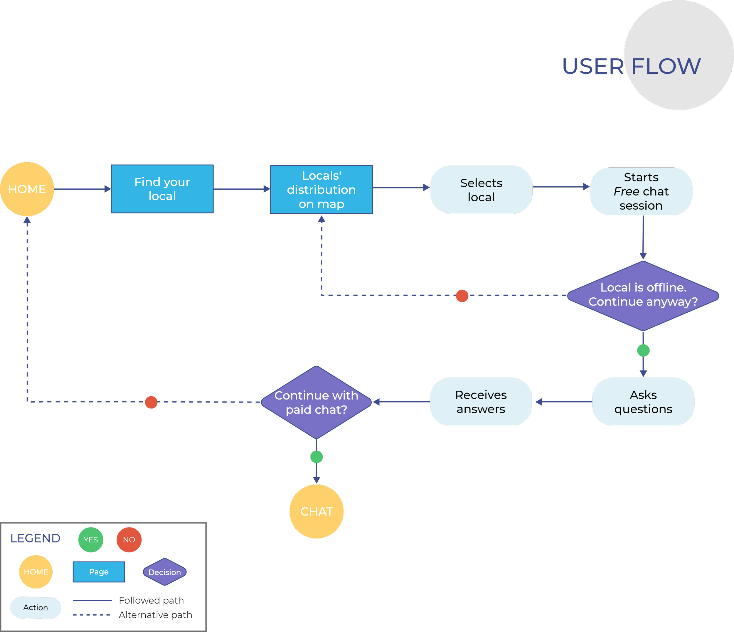
Focusing on my Personas, I created User Flows to guide me through specific tasks and how the users will navigate them. I included three of the most relevant tasks – searching and contacting a local, as well as engaging with the app through a blog.
This, together with the Content Audit of First-Mobile design, will help me to see the necessary pages to start building the app's Information Architecture.
IA STRUCTURE
SITE MAP &
CARD SORTING
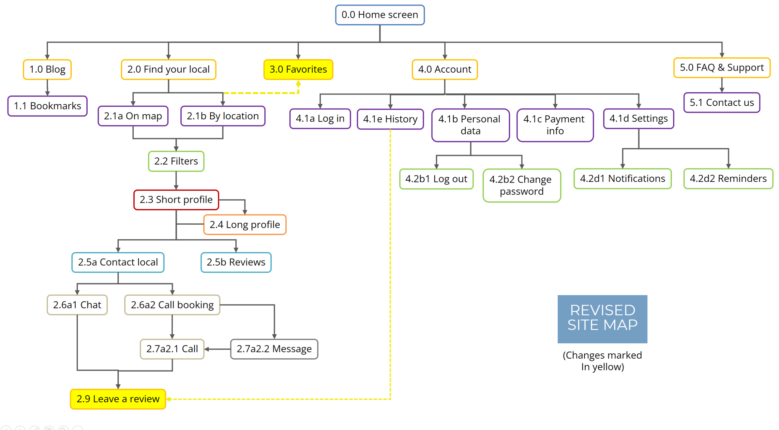
To illustrate the list of pages of the application and their hierarchy, I created a Site Map. My initial map was tested and revised with Card Sorting.
INITIAL SITE MAP
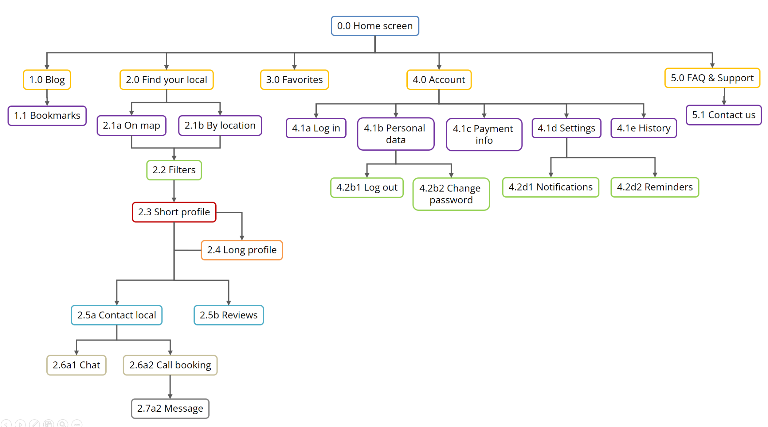
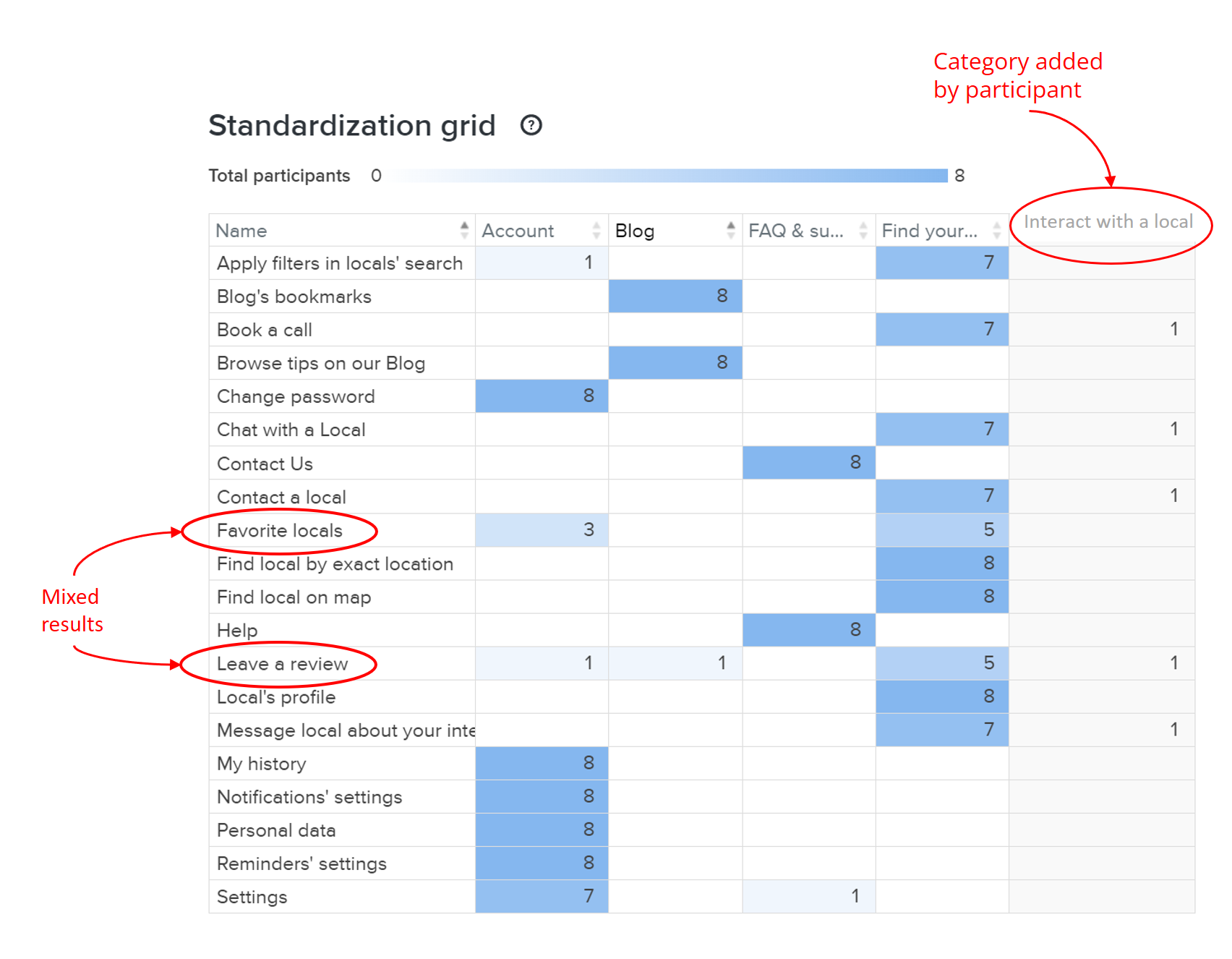
CARD SORTING RESULTS
I carried out an online hybrid card sorting using OptimalSort. In general, all the participants agreed on the sorting, leading to no substantial changes in the original site map.
REVISED MAP
PROTOTYPE PHASE
Build and test ideas
BEGINNINGS
LOW-FIDELITY
WIREFRAMES &
FIRST PROTOTYPE
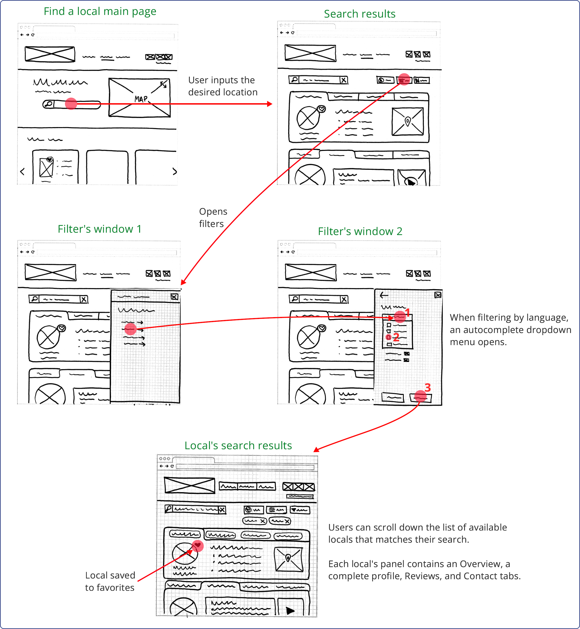
With the Site Map and some initial ideas for Task Flows, I started sketching with pen and paper low-fidelity Wireframes of the app's main pages. These came together to form the first Prototype, depicting the navigation of 3 of the app's core features.
LOW-FIDELITY DESKTOP AND MOBILE WIREFRAMES
Brainstorming some initial ideas on paper allowed me to be as flexible and fast as possible, focusing on the main structure and navigation of the app instead of visual elements. Even in these initial stages, I kept in mind the Usability Heuristics.
Given that Call on a Local is a responsive web application, I paid particular attention to preserving a similar design for both Desktop and Mobile, thus maintaining the user experience consistent between devices.
LF WIREFRAME EXAMPLE: SIGN-IN/LOG-IN SCREENS

(more LF Wireframes here)
FIRST PROTOTYPE
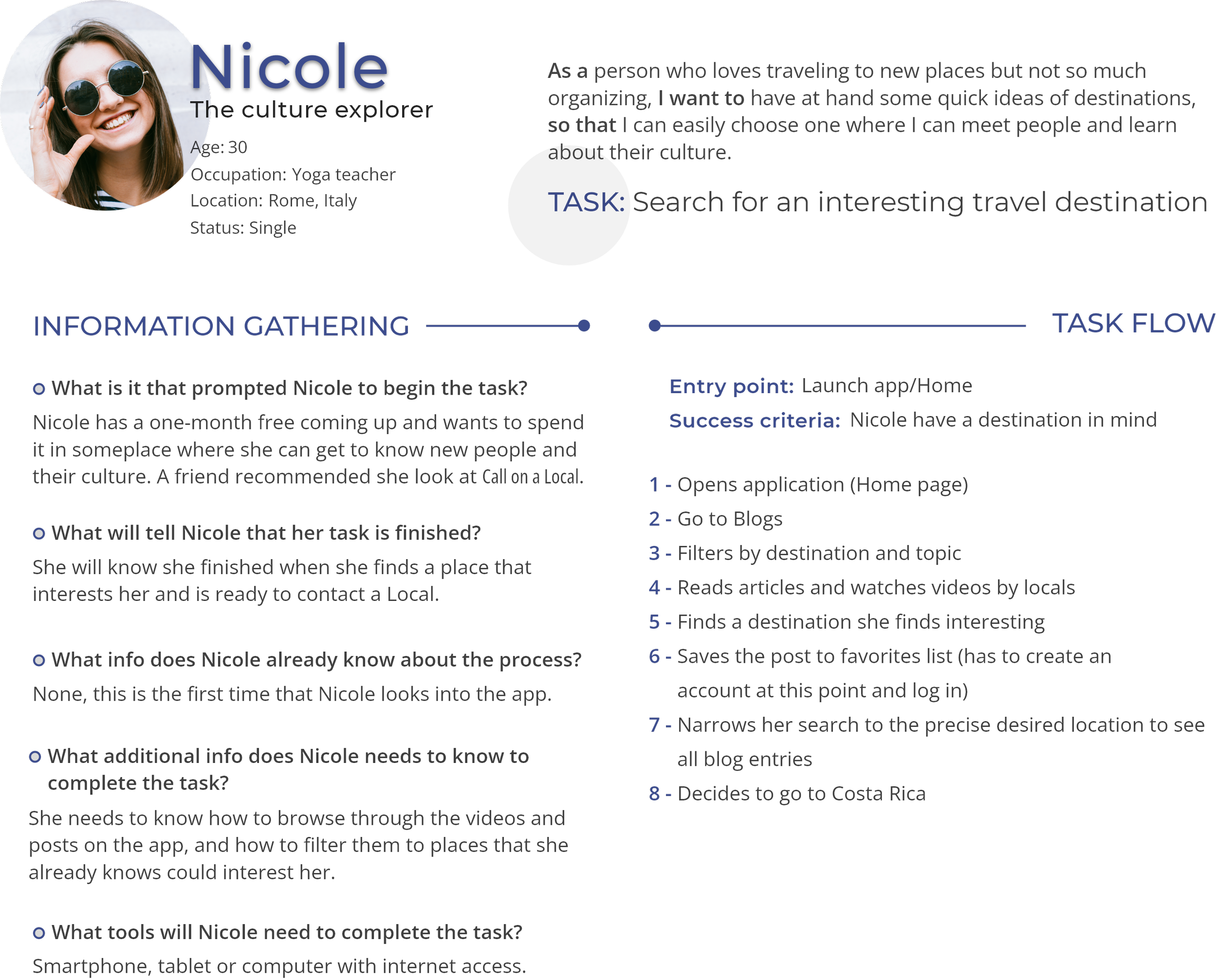
Following the User Flows I created for my Personas, I refined and connected the LF Wireframes to simulate the navigation of 3 main tasks of Call on a Local. As an example, I show one of Nicole's tasks.

DESKTOP LF PROTOTYPE
MOBILE LF PROTOTYPE
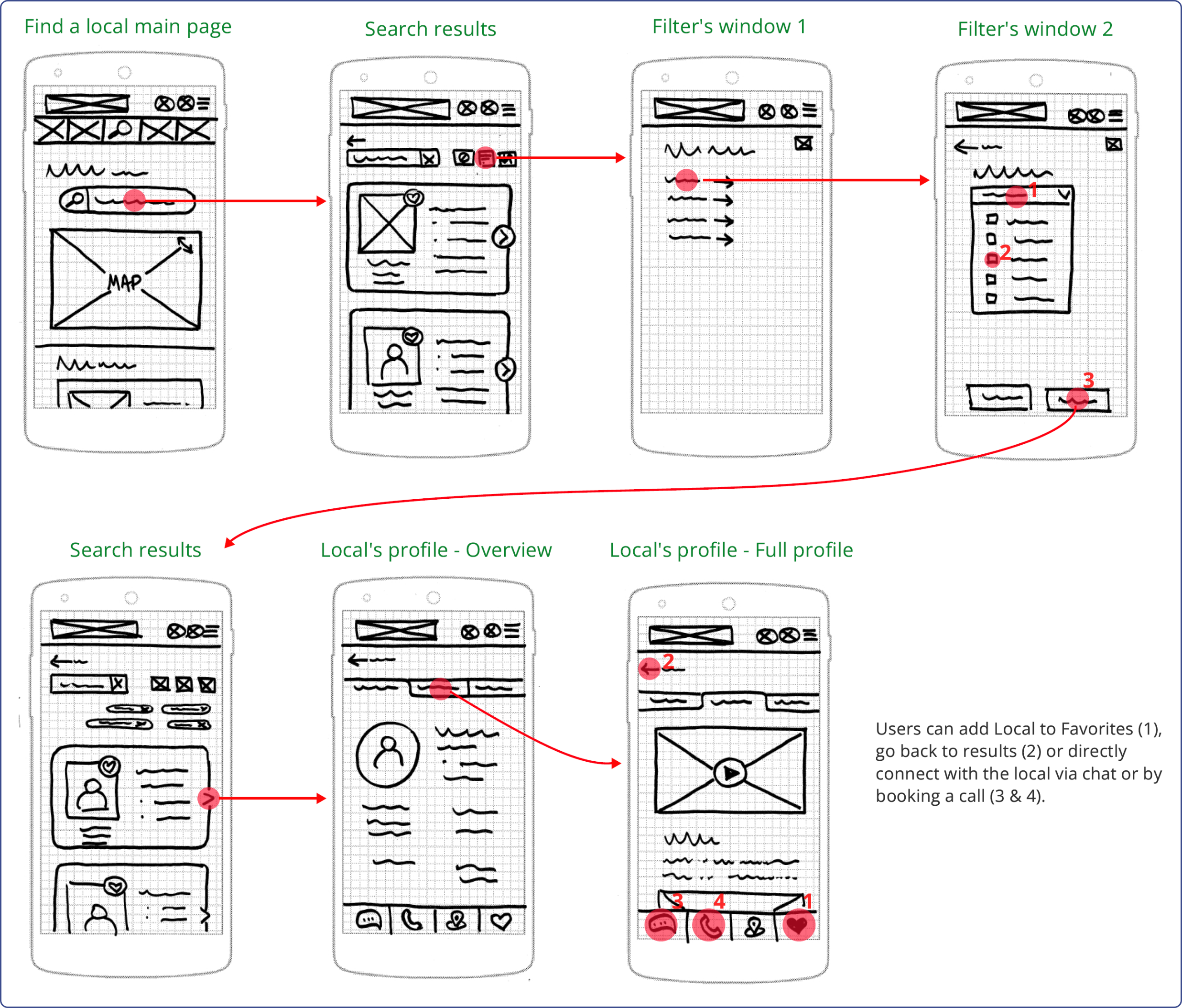
(more LF Prototypes here)
PREPARING FOR USER TESTING
MID-FIDELITY
WIREFRAMES &
CLICKABLE
PROTOTYPE
With a better idea of the content and navigation structure of the app, I produced mid-fidelity Wireframes and a clickable prototype to prepare for user testing. Potentially, users will use this app on the go. Thus, I focused on its mobile version.
MID-FIDELITY WIREFRAMES
Using Figma, I added details to my mobile LF Wireframes and Prototypes, which allowed me to test the app's functionalities with potential users.
This was my first time using Figma. I enjoyed learning some of its tricks and functionalities while – at the same time – bringing to life a most realistic view of Call on a Local.
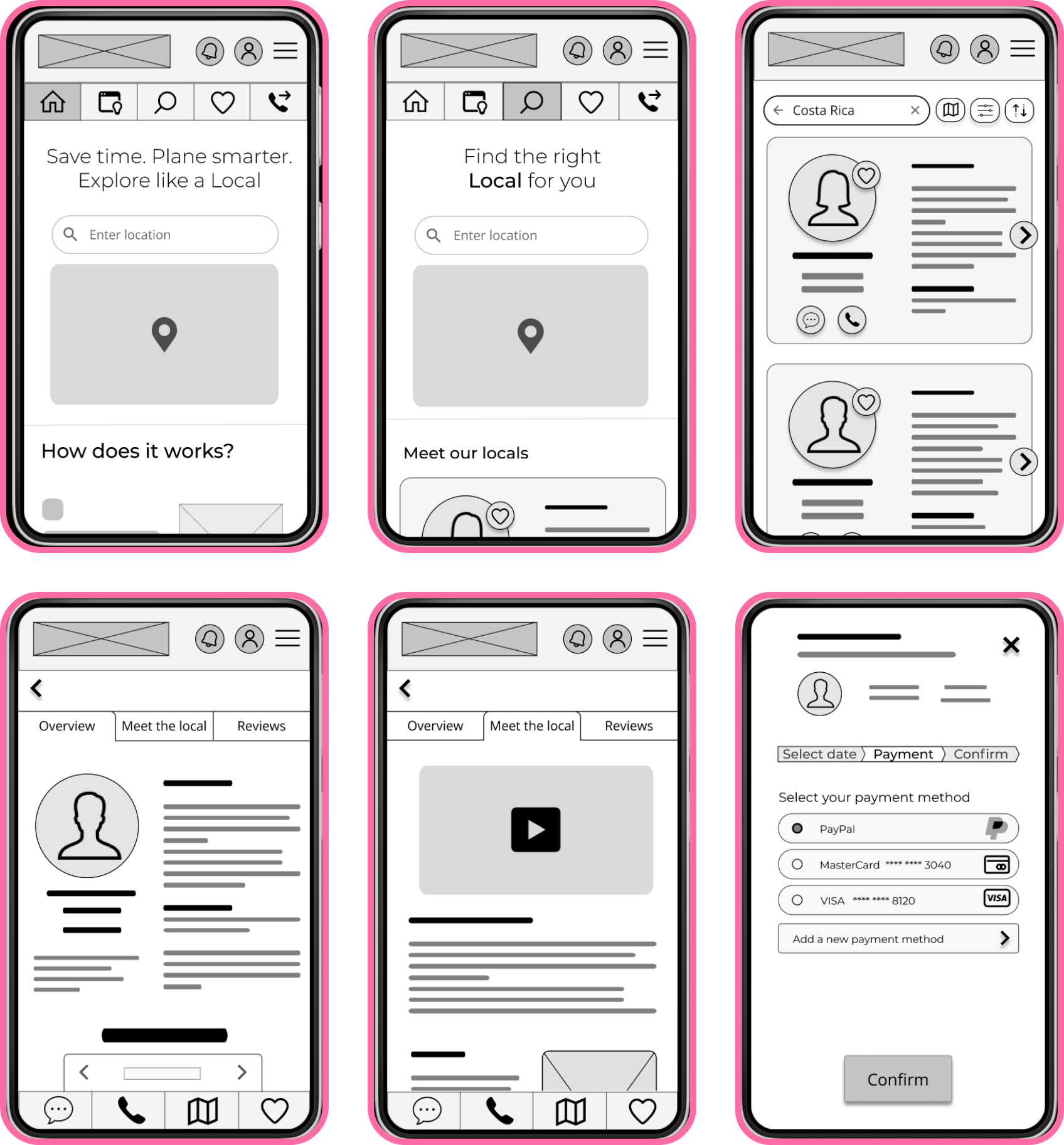
CLICKABLE PROTOTYPE
I created a prototype for 3 different flows:
Browse the app's Blog in search of inspiration
Search a Local and add it to My Favorites
Book a call with one of My Favorite Locals
EVALUATE PHASE
Are we on the right track?
TESTING WITH POTENTIAL USERS
USABILITY &
PREFERENCE
TESTS
Does my solution answer the problem? There is no better way to know that than directly asking potential users. Testing the design at early stages can save time and recourses. For this, I conducted a Usability test and a Preference test.
The updated prototype can be found here.
USABILITY TEST
To test the Usability of Call on a Local, I recruited 6 participants to conduct a moderated remote test. Having the First-Mobile approach in mind and taking into account that Call on a Local will potentially be used “on the go”, I tested the mobile version of the prototype.
The complete test plan can be found here. I prepared in advance the script for the testing sessions, including background and open questions for the participants and three different Scenario Tasks. The detailed script and questions can be found here.
OBJECTIVES
Determine if users can quickly and easily understand what the app is for
Observe how users navigate and access the app’s core functions
Determine where app produces user friction and why
TASKS
Browse the Blog, set filters, and bookmark an article
Search a Local and add them to Favorites
Book a call with a Favorite Local
PARTICIPANTS

RESULTS AND ANALYSIS
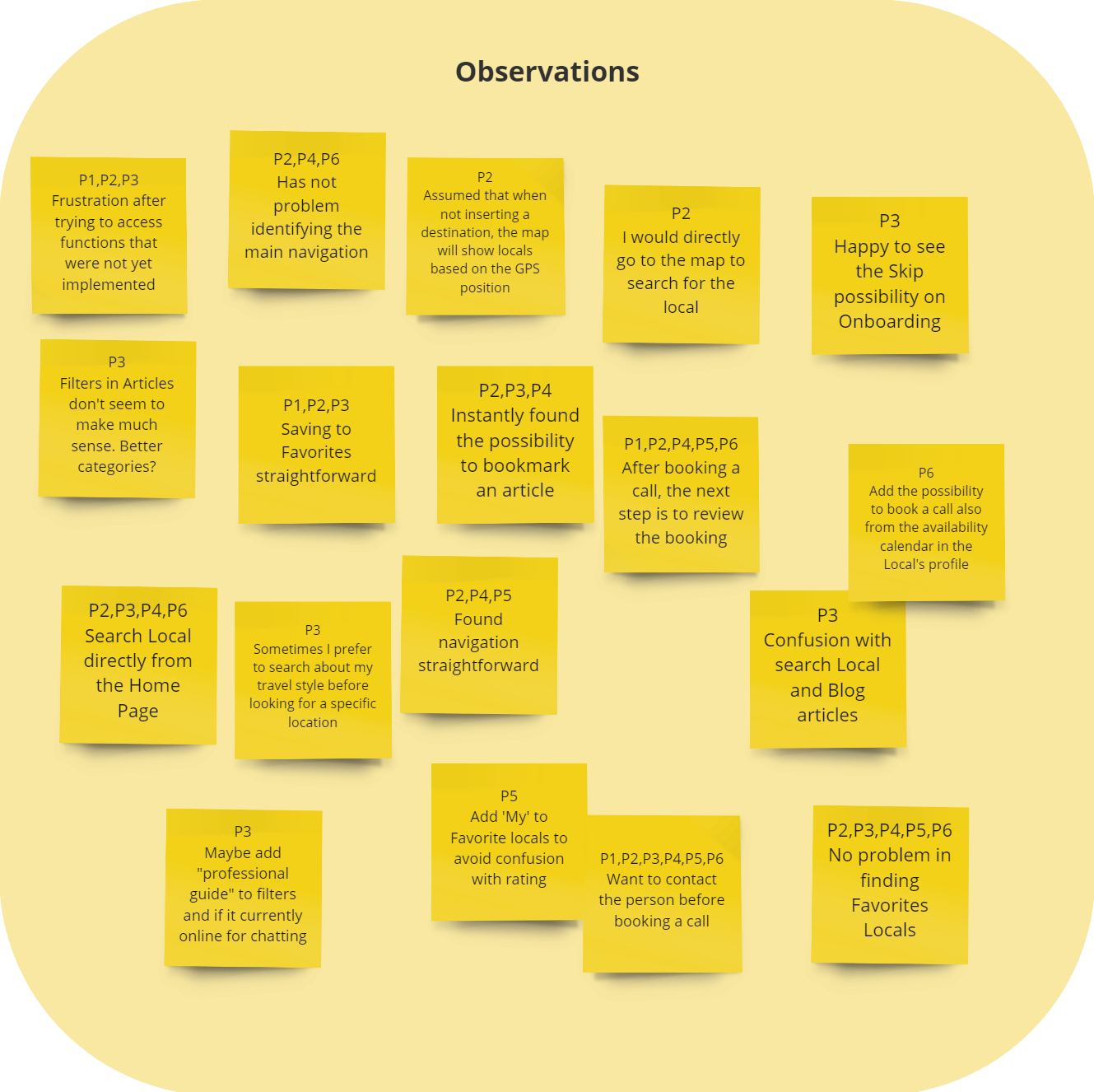
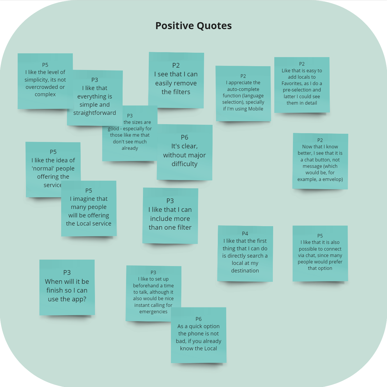
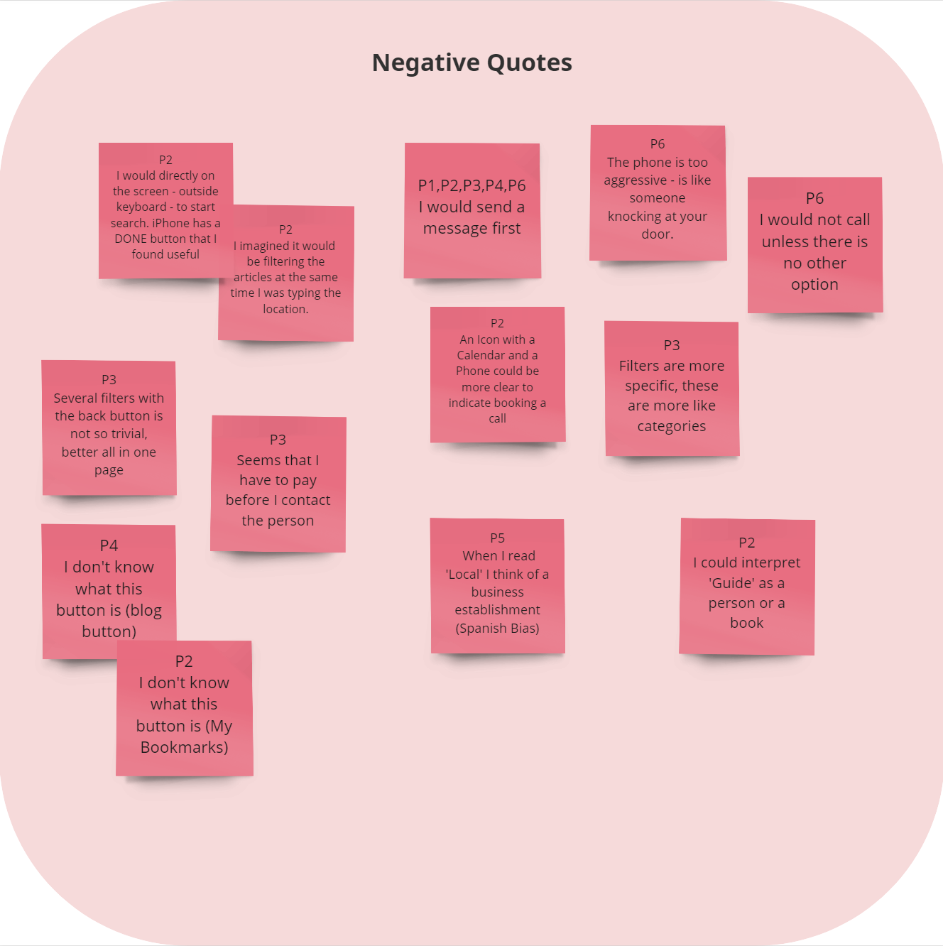
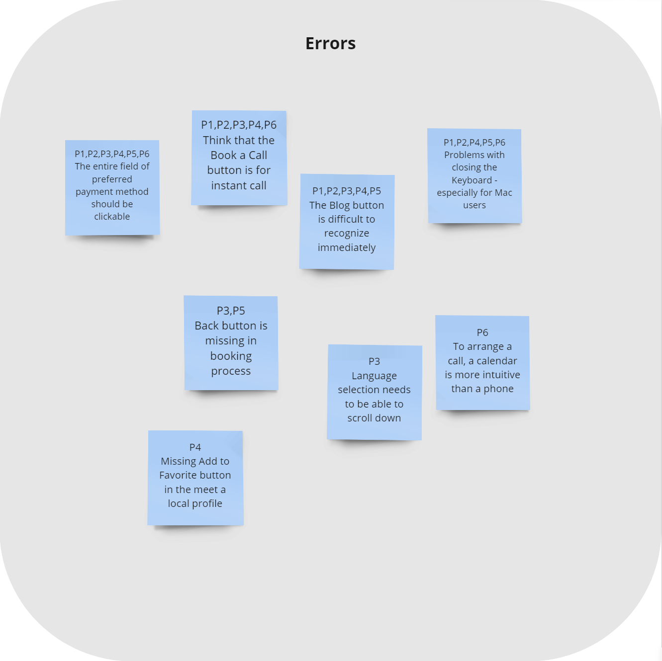
All the participants expressed a high level of satisfaction and interest in the application. They found the application simple and easy to use. However, some issues were discovered that need to be addressed.
For the analysis, I organized the data collected during the recorded test sessions using an Affinity Map. Once the data was organized, I analyzed it and organized the findings using a Rainbow Spreadsheet. Rating the information with Jakob Nielsen’s severity scale, it was possible to prioritize the changes necessary to improve the design.
AFFINITY MAP
RAINBOW SPREADSHEET

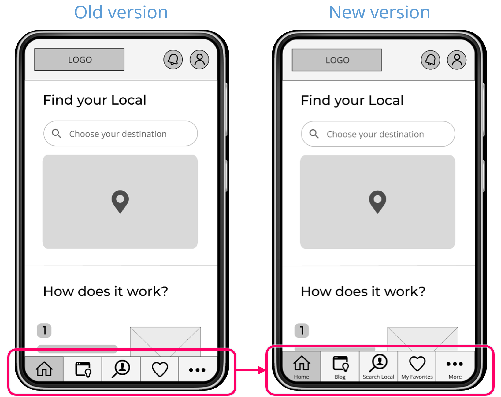
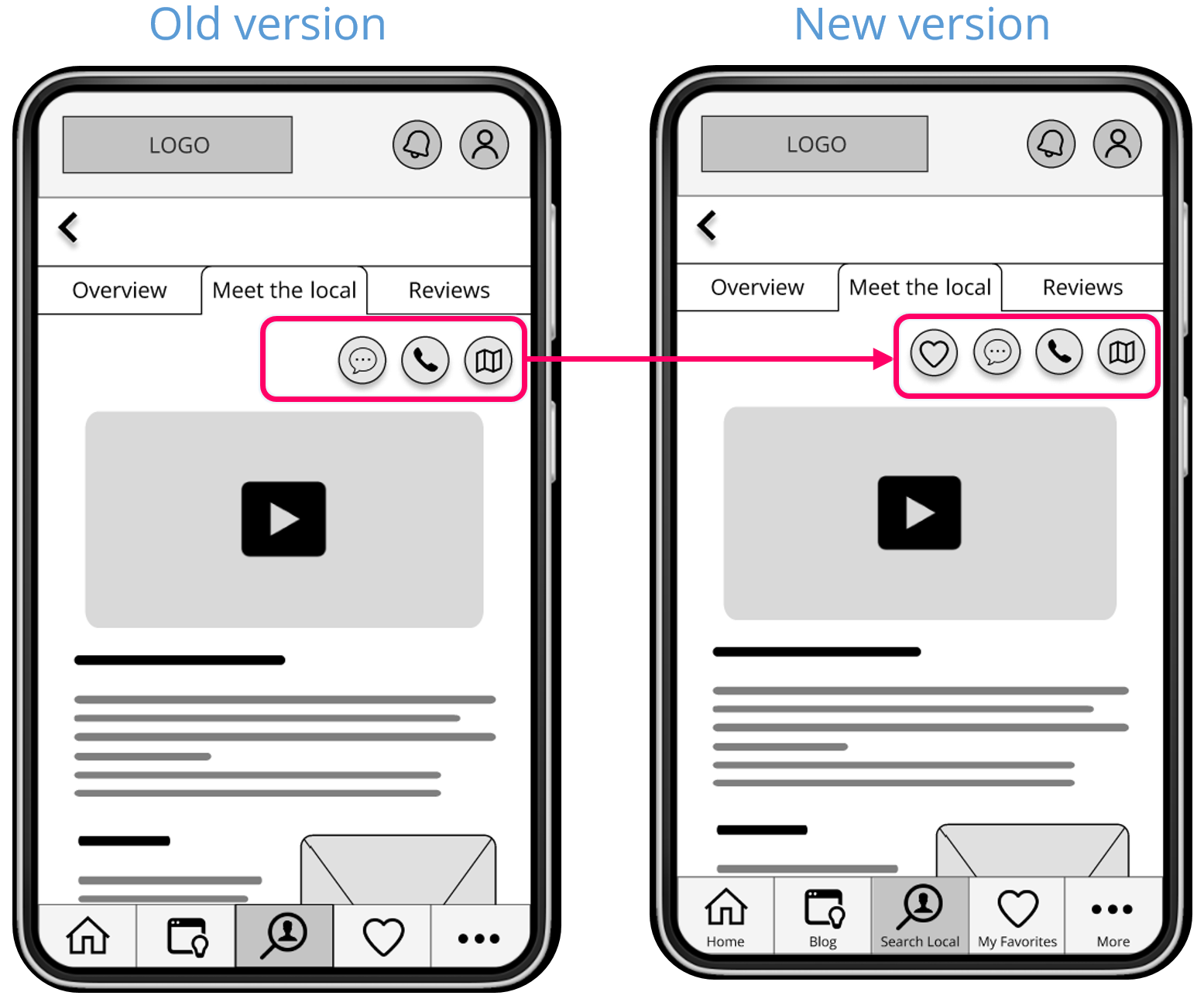
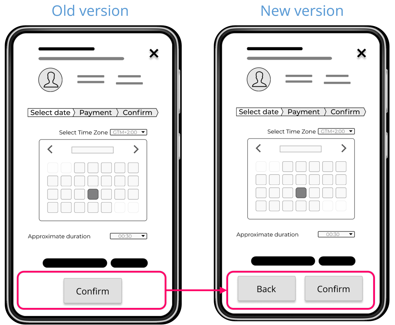
POTENTIAL IMPROVEMENTS
Based on the collected data, I prioritized 5 issues that need to be solved. Bellow, I show some examples of the changes made to the design. A full description and the revised prototype can be found here: Usability Test Recommendations & Revised Prototype.
PREFERENCE TEST
I create two versions of the Splash screen showing small variations and used UsabilityHub to create a Preference test. A total of 14 participants took part in the test. The objective was to discover what was more simple and eye-catching to the participants.
Option 2 – 79%
Option 1 – 21%
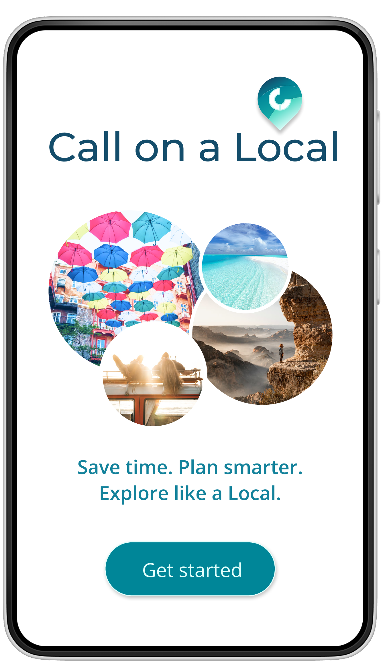
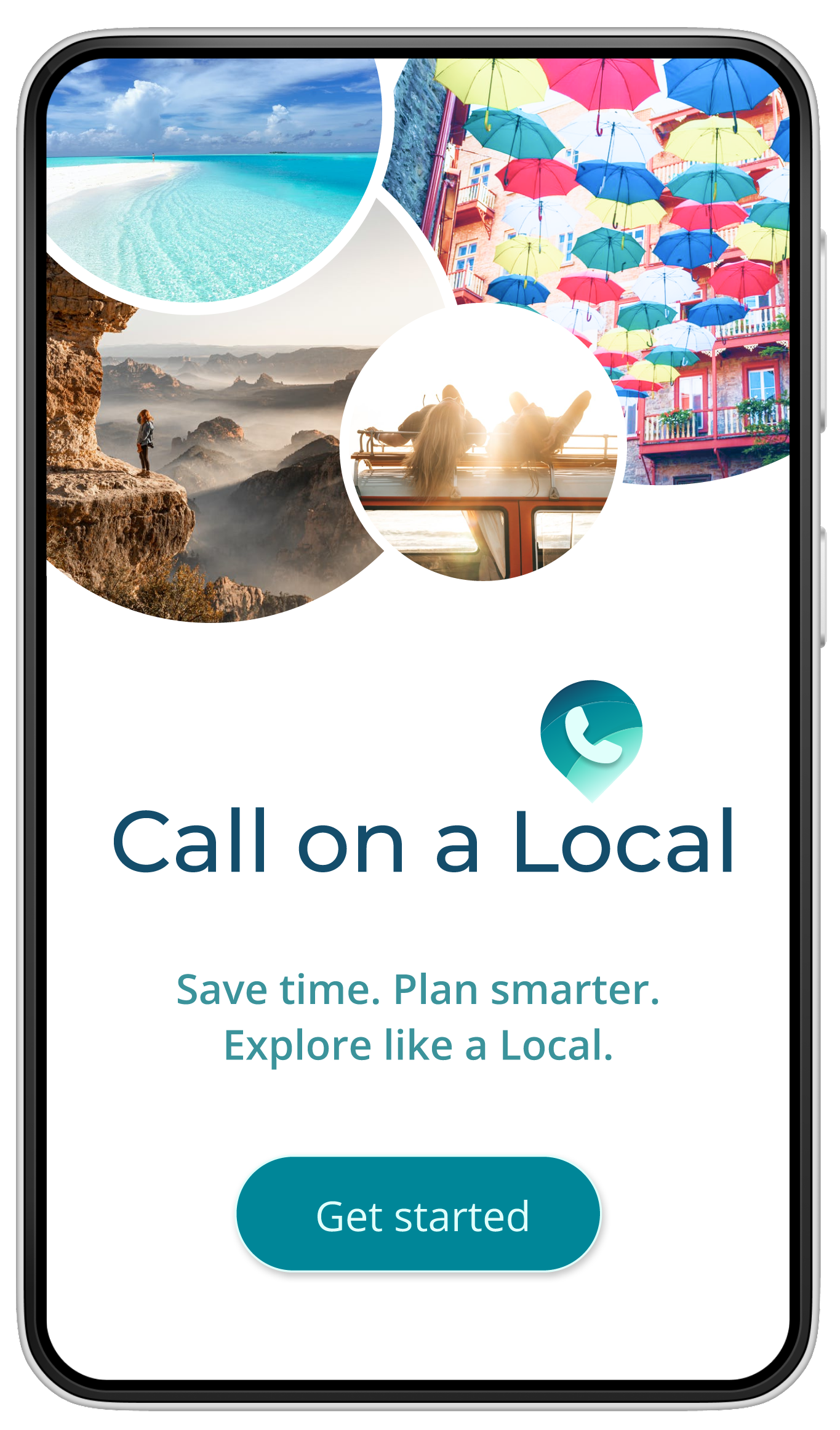
Comments from the participants:
• The images are larger and can be seen more clearly
• I like this logo. The text is grouped together
• The pictures are bigger and the impact is more powerful
• Bigger pictures
• More clear
• Pretty
• Just like it better
• The design looks very nice

REFINE & ITERATE
Implementing & testing the Visual Design
VISUAL DESIGN
HIGH-FIDELITY
PROTOTYPE
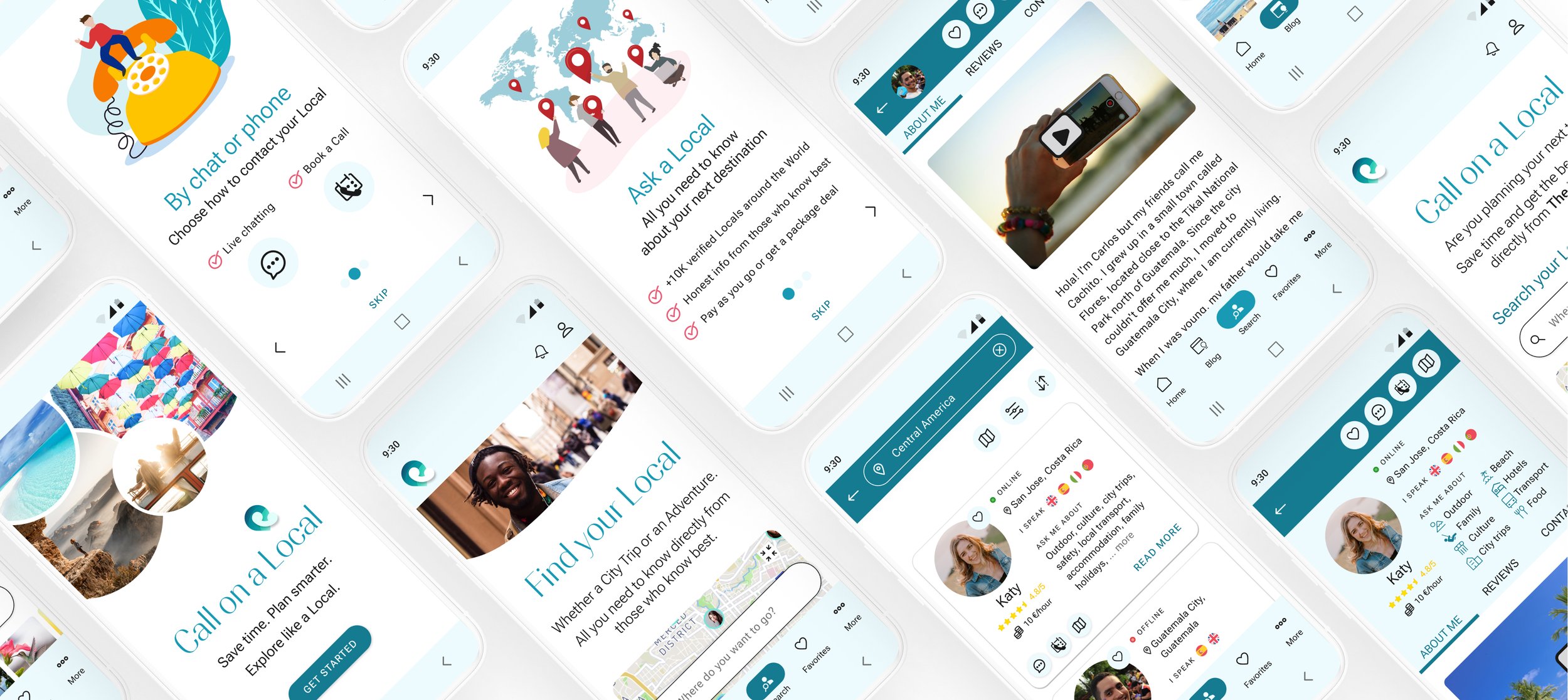
With a good idea of the overall design of the app, I developed a Design System Language and created a HF Prototype. I opted to start with the smallest Android frame to prioritize the main functions of Call on a Local and facilitate future expansions to larger screen sizes.
I used the feedback from Peer Reviews to polish the design.
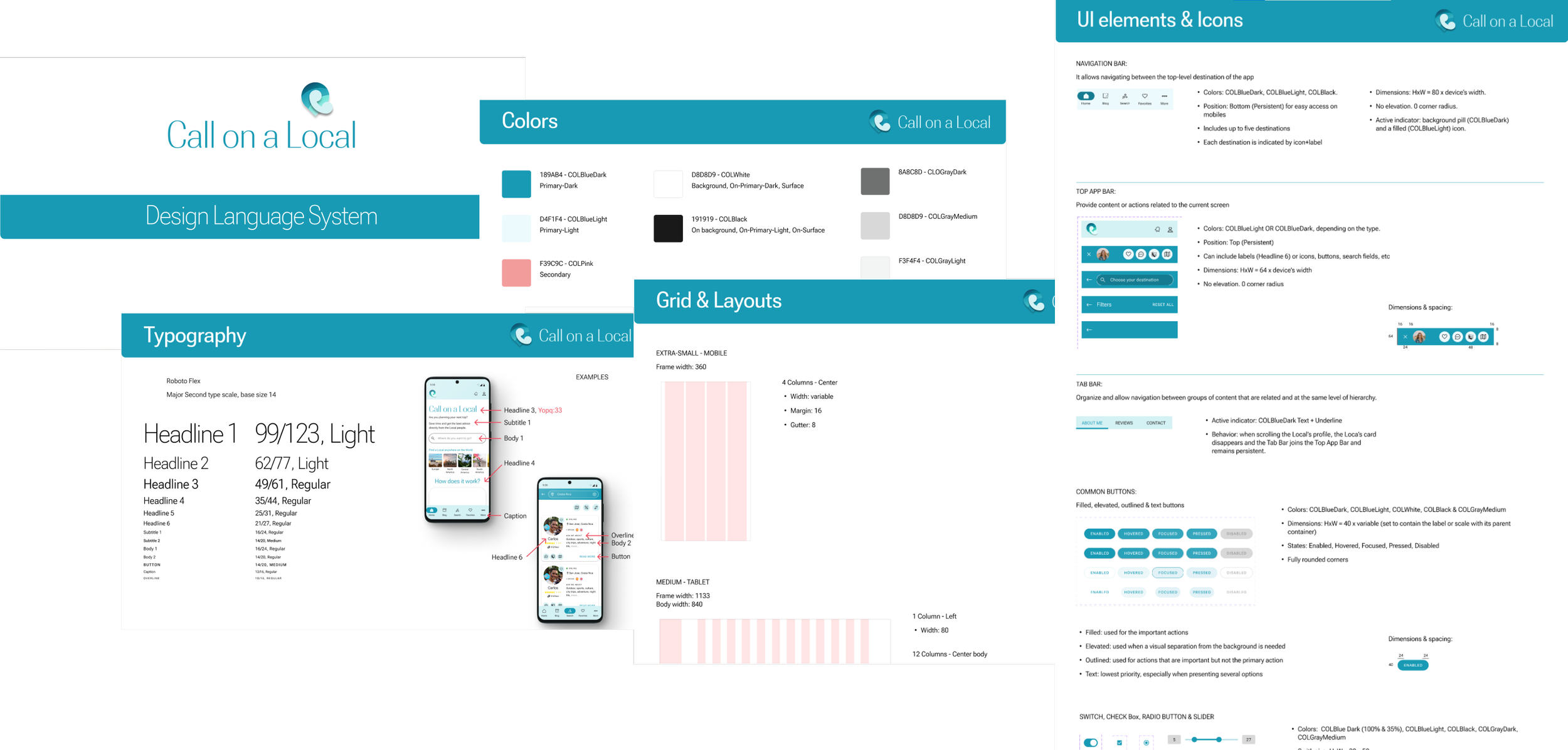
DESIGN SYSTEM LANGUAGE
Keeping the Design Principles and Gestalt Properties in mind, I developed the overall Visual Design of the app, aimed to evoke a professional yet friendly feeling, promoting the trust of the users. I kept the design simple, using whenever possible common elements from Material Design to facilitate usability. User engagement was boosted based on Emotional Design strategies.
To ensure that the overall design of the app maintains consistency and to facilitate hand-off, I built a Design System Language, including Pattern Libraries and Style Guides, as well as general guidelines and rules.
Here you can access the full Design Language System.
PEER REVIEW
With the HF Prototype ready, I received feedback from 3 Peers based on their experience. This helped me to spot and correct some points before wrapping things up. Not necessarily all suggestions were implemented – but only the ones that aligned with the project goals. I enjoyed the process, which taught me how it will be to collaborate on large projects with other designers and to give and receive feedback.
HF PROTOTYPE REVISED
The latest version of the Prototype can be found here.
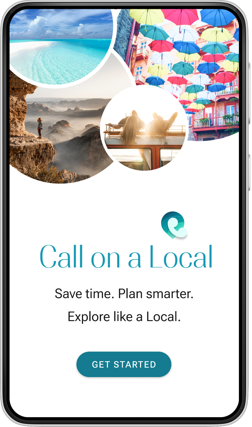
SPLASH & BOARDING SCREENS


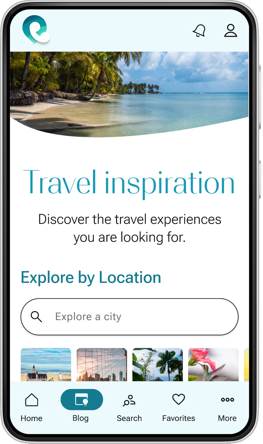
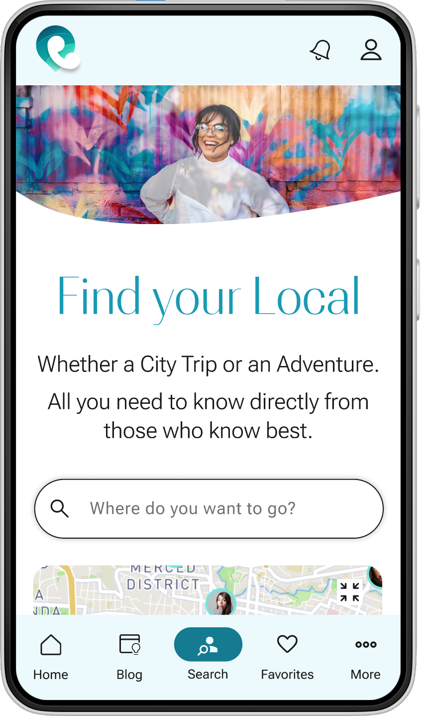
HOME & SEARCH LOCALS MAIN SCREENS


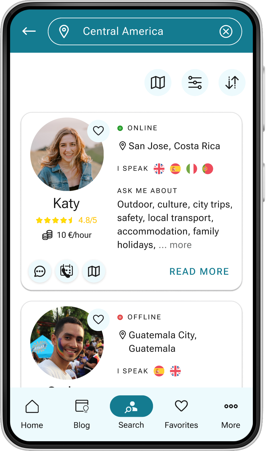
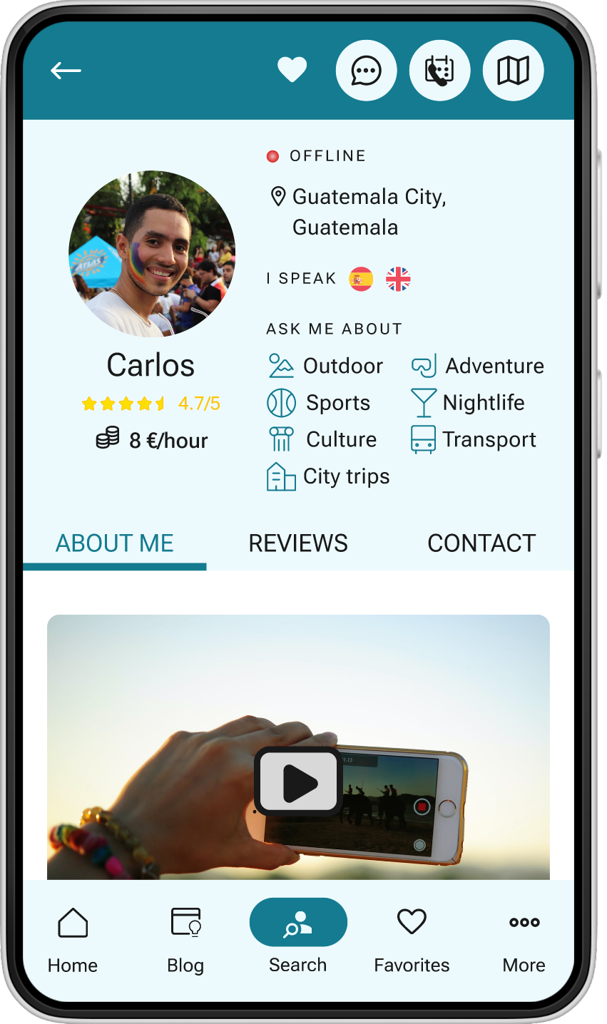
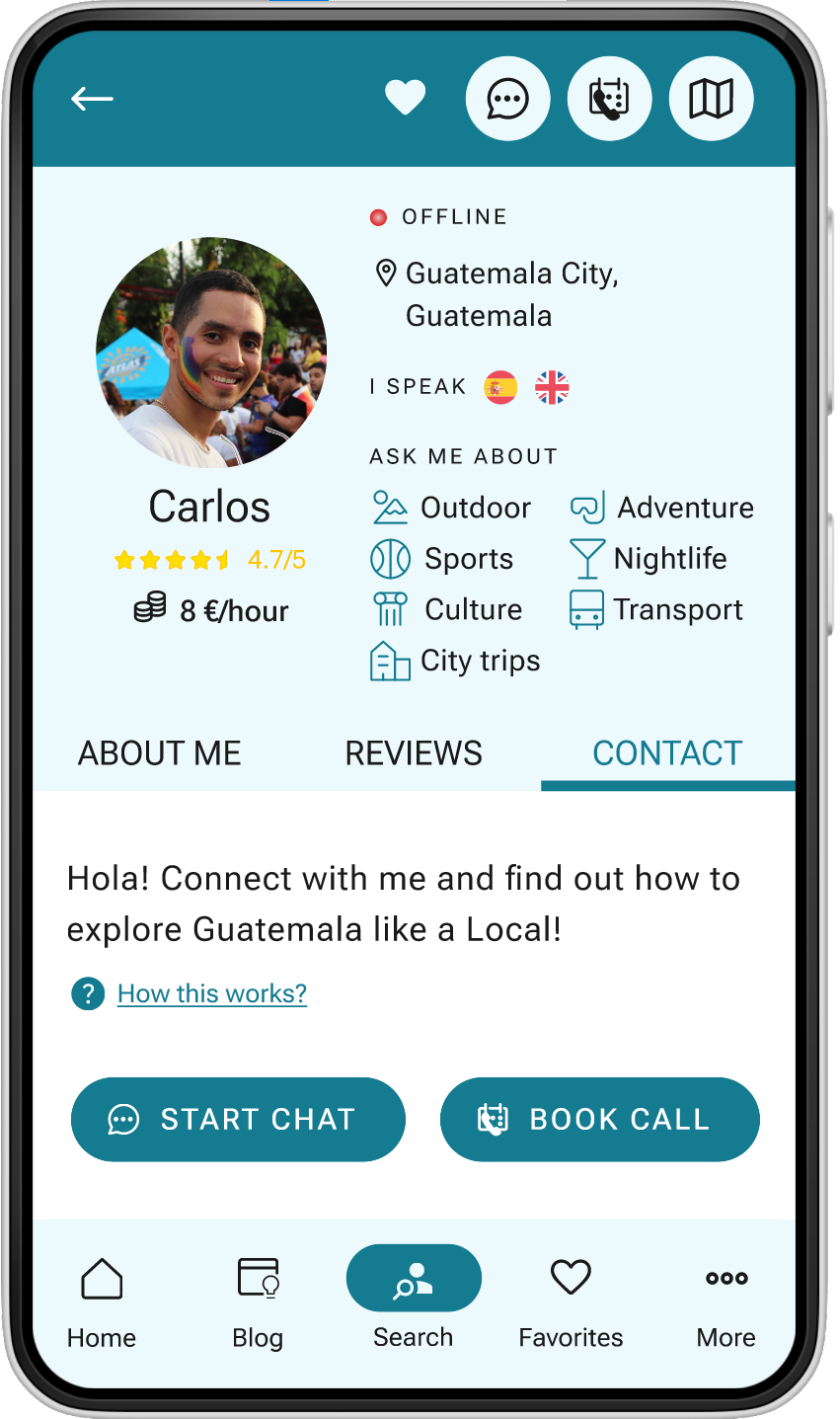
LOCAL’S SEARCH RESULTS AND PROFILE

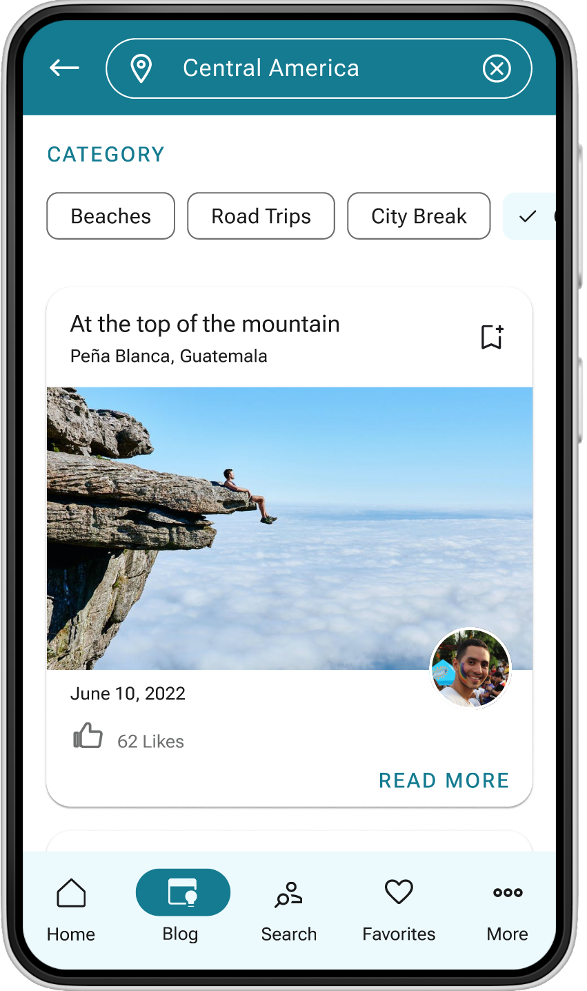
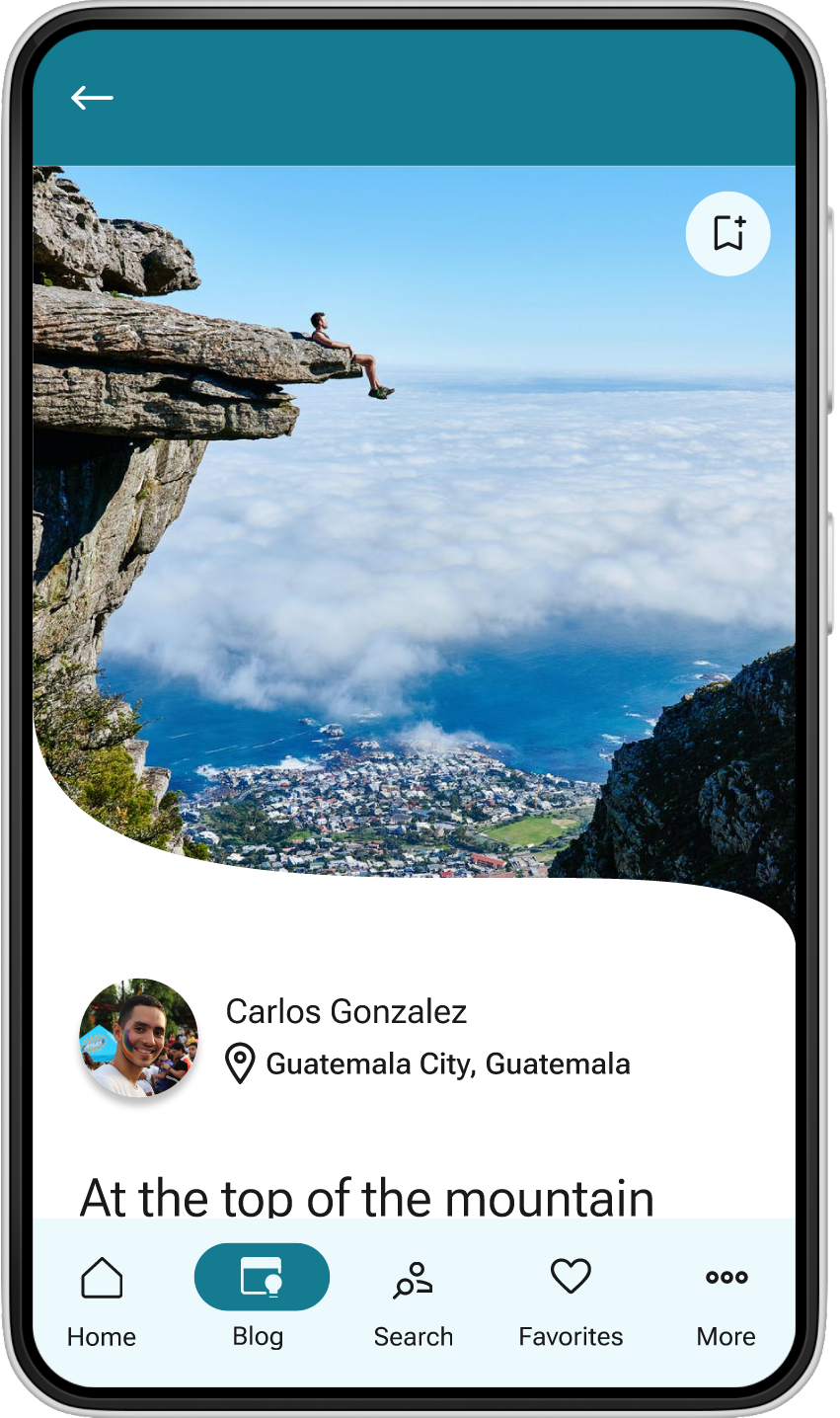
TRAVEL BLOG